8 Paint Colors For A Learning Environment
If you’re a student, teacher, or a parent helping kids with homework, you may not have thought about how paint color can affect learning. But just as colors impact mood, they can also enhance memory and improve focus. Here are some of the best colors for study rooms in your home that have been proven to help us learn.
Off-White
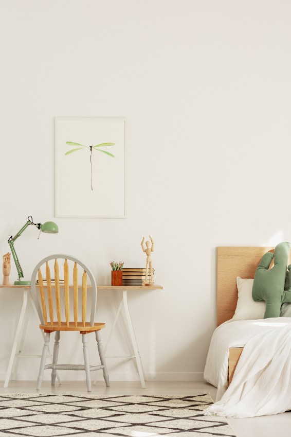
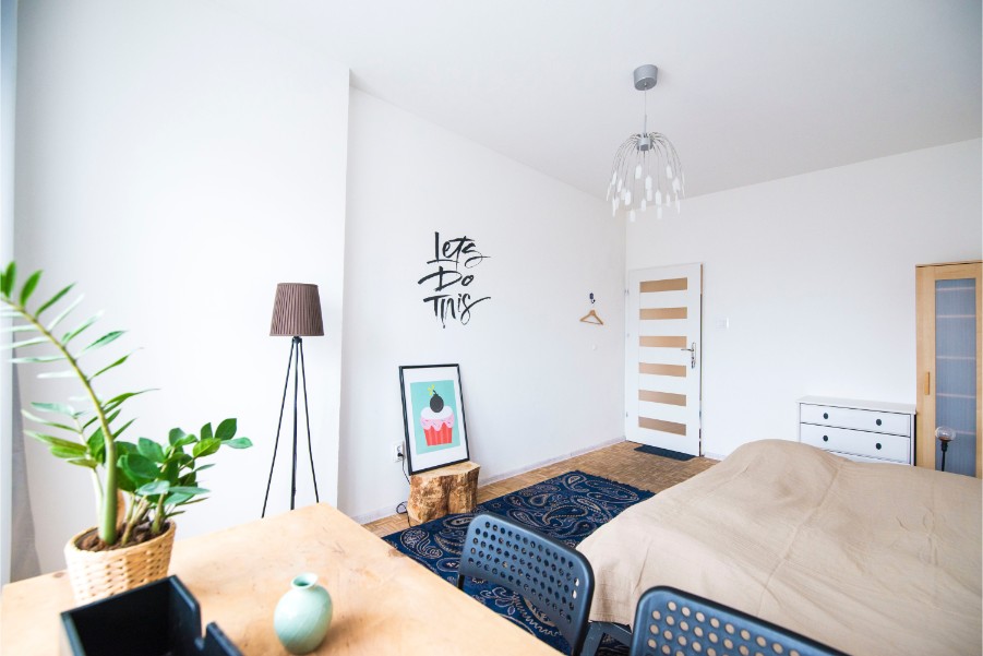
While the bedroom’s focus is sleeping, often, it’s also homework central. Calming, neutral colors like off-white create positive feelings and help studiers engage. Paint the walls Delicate White and pick up the color in the bed linens.
Red
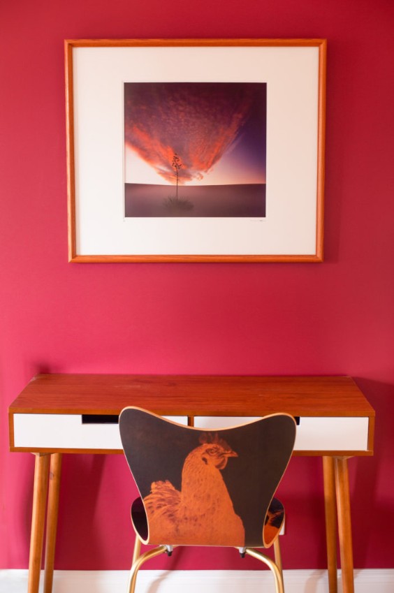
Paint colors work as a signal, telling the brain to align behaviors and feelings with the purpose of a space. It also enhances storytelling (think about brightly colored children’s books) and evokes emotions, from annoyance to serenity. Like the dining room, a kitchen is often a place where laptops live between meals. Use soothing colors (try Aria for the walls and Steeple Gray for the cabinets). Add pops of your favorite shade of red to enhance creativity and create a sense of alertness. But don’t go overboard — too much red can make you anxious or overly excited.
Orange
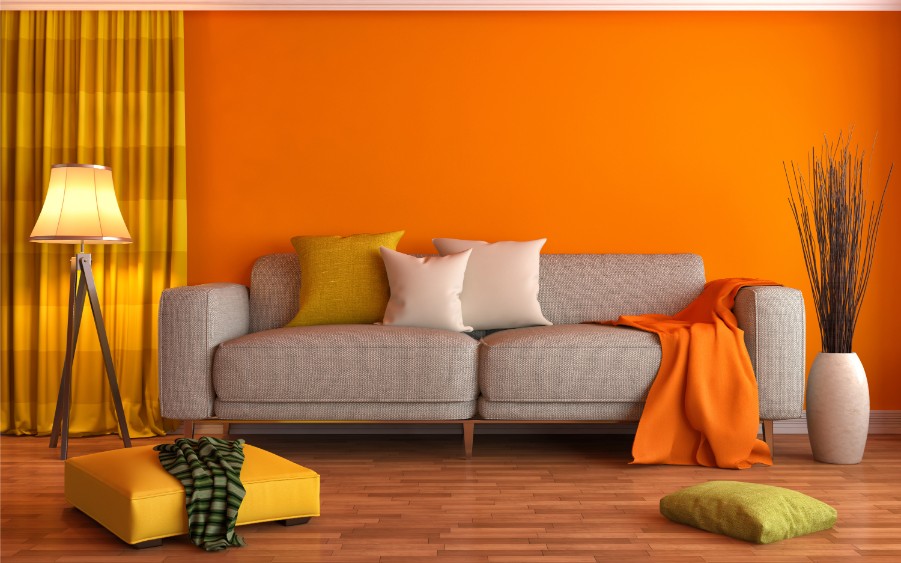
When color expert Maria Killam designed her home office, she chose interior paint the color of orange sherbet. Secondary colors like orange and green naturally create a balanced palette, producing a calm, alert mind that’s ready to learn.
Yellow
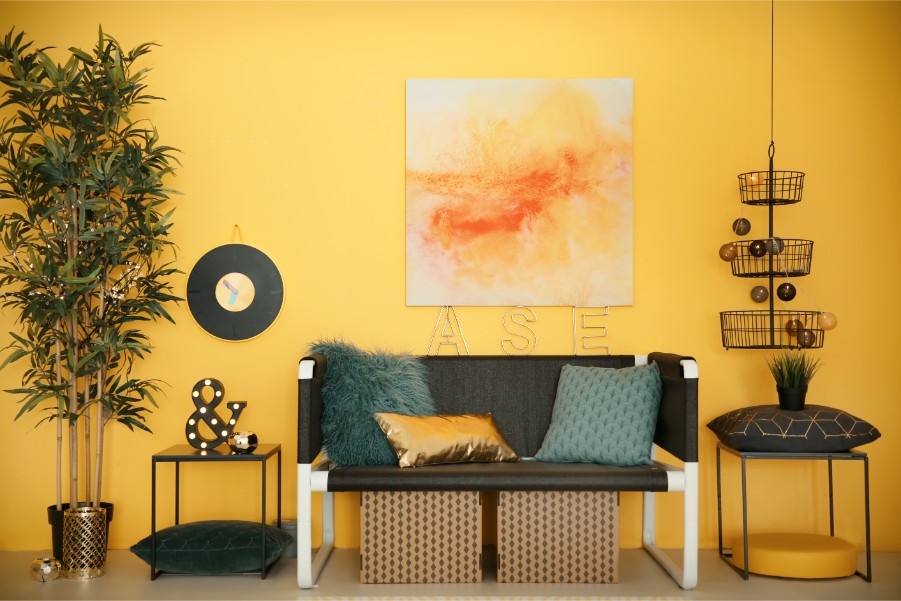
When creating a space conducive to learning, think about stimulating learners — but not over-stimulating them. Large fields of bright colors, like red and orange, can make you bounce off the walls. Instead, soothing yellow promotes calmness, comfort, relaxation, and happiness. Yellow (like Limitless) also helps hold learners’ attention and foster creativity, making it one of the best wall colors for learning space.
Brown
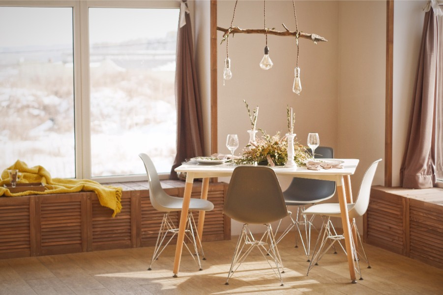
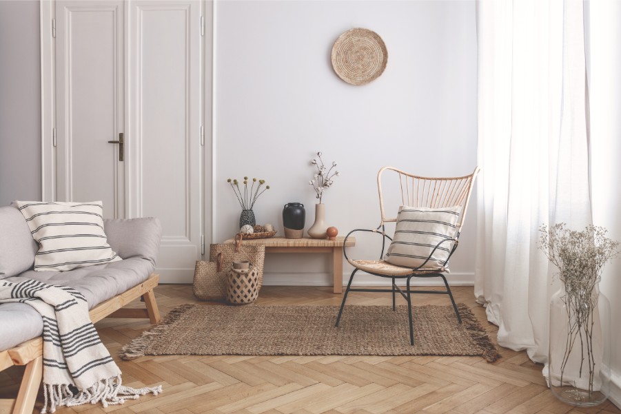
Brown gets a bad rap as being bland. But the right mix of browns can reduce fatigue and promote a sense of relaxation and security. Keep work sessions on task by using brown in a range of colors and textures, like striped upholstery, a velvety throw, geometric curtains, and wood accents.
Green
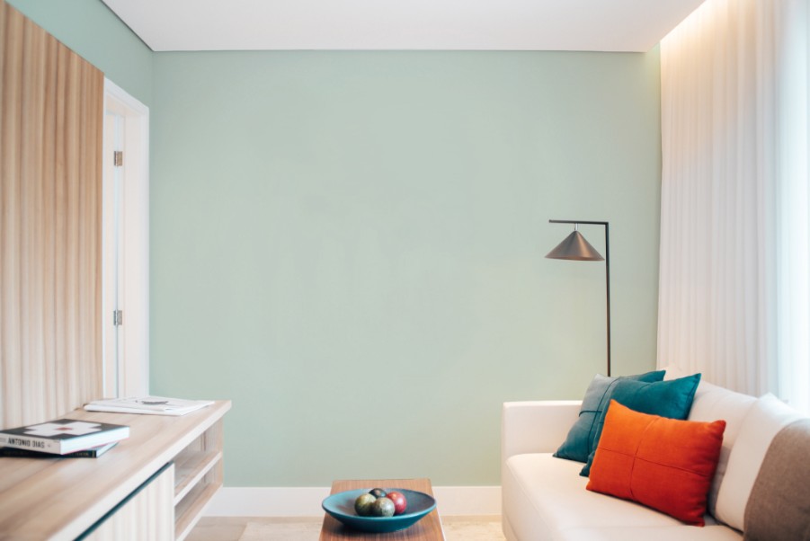
Because of its relationship to nature, green causes us to stop, take a deep breath, and relax. Since a reading area’s purpose is to allow readers to reflect, it’s the perfect spot for a dark, leafy green. Steer away from institutional greens (those despised mid-tone hues that many schools and hospitals used), focusing instead on shades like Night Watch. Subliminally cue green’s relationship to nature by pairing it with wood, house plants, and warm earth tones.
Purple
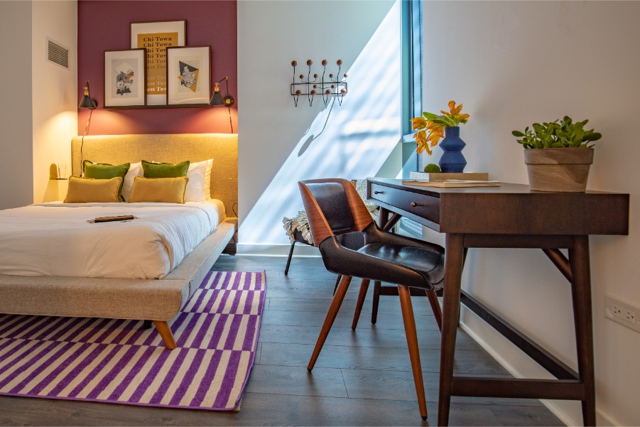
Purple’s pale side imparts a sense of calm on a workspace. Use purple paint in a child’s bedroom (or any area someone is studying) to enhance learning. This hue’s calming effect reduces the effort required in thinking and helps the brain make cognitive connections more easily.
Blue
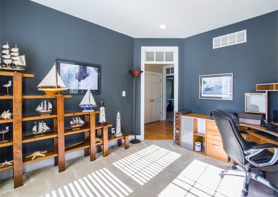
It’s best to have a calming and neutral color on the walls, like this sky blue (try Lost At Sea). This color is tranquilizing and creates a sense of well-being. To keep the room from becoming so soothing it causes naps, add a splash of color with furniture. Color is used in smaller amounts on furniture, so it doesn’t have the same overstimulating effect as bright colors on walls.
If you’re designing an area where learning is the focus, don’t forget the color. This key component of visual communication can help us focus, connect information, and enhance learning.

