Featured Project: Grisoro Designs Renovates Southampton Bungalow
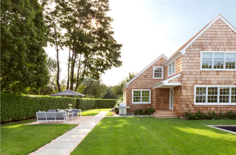
Paintzen recently partnered with Grisoro Designs, a New York-based interior design firm, to completely renovate a ‘50s style bungalow in Southampton, NY.
We spoke with Grisoro’s founder, Gabriela Gargano, to talk about the project and her path to becoming one of New York’s rising star interior designers, and how she embodies her firm’s moto: Gris and Oro – together, the elements, grey, and gold, bring together the rough and refined.
Business Never Looked So Good
Grisoro Designs has an interesting hybrid business model fusing design and real estate investing that perfectly matches Gabriela Gargano’s interests and expertise.
“Interior design and real estate have both been long-standing passions of mine. When I was 14, my first job was at an interior design boutique, where I worked throughout high school and for my first two summers of college.”
After graduating from college, Gabriela started investing in real estate. “After renovating my first apartment in a small co-op in Chelsea, NY, I saw a lot of ways to improve the building’s financials and increase property value for the owners. I gradually worked my way up to president of the building. I was able to make a positive impact by changing our super, switching our heating providers, upgrading our lobby, and raising funds to add a communal roof deck.”
Grey & Gold
Gargano later found that improved financials and sound investments, plus better design, really impacted property value. She initially started Grisoro Designs as a creative outlet and to work on her own renovations. Inquiries from clients started to flood in, so Gargano decided to focus on design full-time!
Just this year, Grisoro Designs expanded beyond interior design. With the launch of Grisoro Properties, Gargano looks to capitalize on real estate investment.
“For now, it’s just my own investments, but I’ll likely open this to outside investors over time. Overall, I find that my clients find a great benefit because I invest in real estate – it helps them think through their own renovations and how to balance elements that will increase property value with ones that give them personal enjoyment. There’s a practical, pragmatic approach to a creative process that seems to resonate well!”
Cedar Hedge House
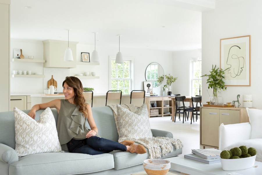
Cedar Hedge House, a luxury rental home in Southampton, NY, was one venture that Grisoro Designs took on. The project breathed life into a small ’50s cottage and transformed it into a hot rental space in Southampton.

There was a lot of work to be done, but the bones of the space were intact and strong.
Gargano and her team wanted to expand the floor plan but wanted to maintain the home’s overall integrity.
Paintzen joined the project, and our house painting crew was one of many crews on-site working to make the renovation a success. In addition to painting and wallpaper installation, Paintzen did some basic new construction prep work: filling nail holes from trim installation and caulking and priming.
European Inspiration
Gargano wanted to avoid the traditional “beachy” style at the Cedar Hedge House. Instead, she drew inspiration from Danish and French design into the remodel. Tell us about these trends and what colors work well with these designs.
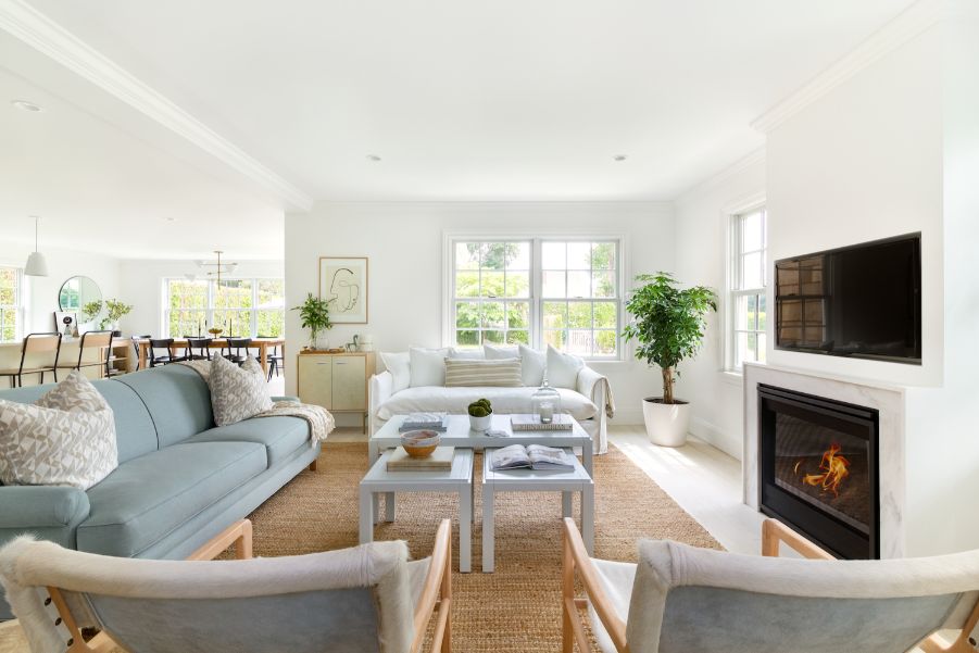
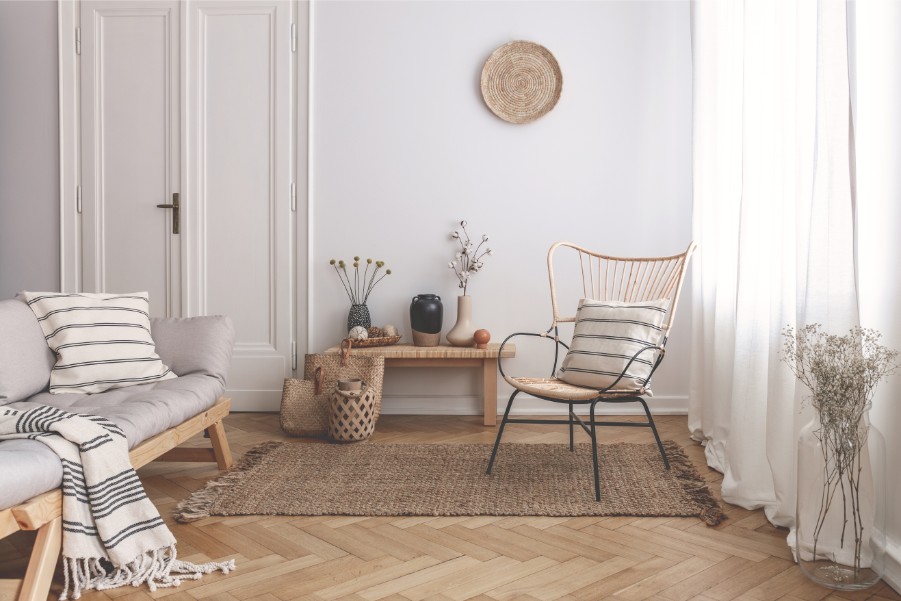
“Danish design captures a sense of simple and functional design that utilizes natural woods, clean lines, and soft curved shapes. French design conjures a blend of modern with antique elements, where the eclectic mix of pieces feels effortless and easy. Broadly speaking, I like both of these concepts as they blend minimalism with eclectic decor. In terms of colors, I find that a color palette of muted tones that range from soft to moody work very well with both design aesthetics and balance well is metals and woods alike.”
A Delicate Thread
One of the paint colors that help tie together the home’s color palette was PPG’s Delicate White.
“Whites are likely the hardest to settle on,” says Gargano. “It may sound funny to say that, but the undertones of a shade of white can really change the atmosphere of a room, and I therefore highly recommend sampling to my clients as it can read very differently from one space to another.”
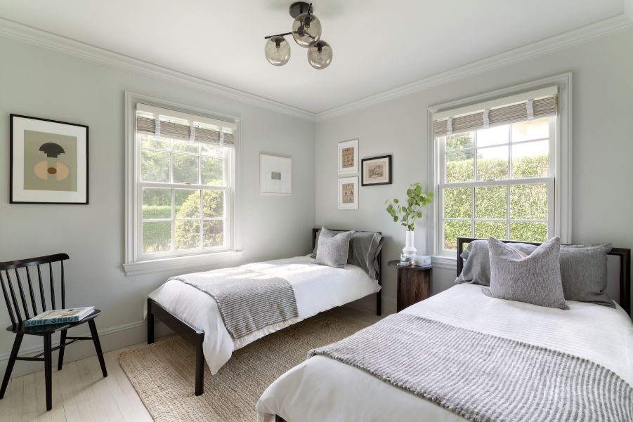
Delicate White is a clean yet soft white. “There aren’t strong undertones to it, so it created a wonderful palette for our furnishings. Since we were combining an original 1950’s home with a new addition, I wanted to unify the larger open spaces and allow the views to really play the lead role. Delicate White did just that, and also provided a gentle contrast to the colors and wallpapers we used in the other rooms.”
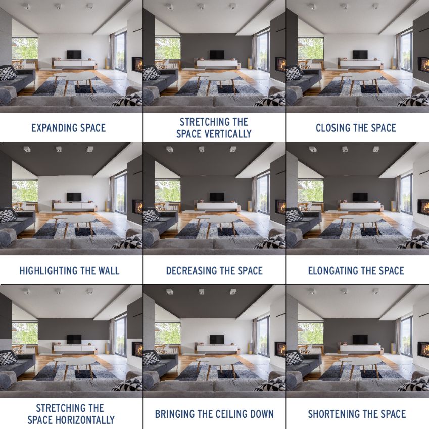
Gargano also notes that she would use white paints in larger rooms, but not in small spaces. “I find anything from soft tones to deeper colors enrich a small space, while white almost highlights it’s size.”
Patterns of Design
In addition to muted paint colors, Grisoro Designs used wallpaper in one of the bedrooms and the downstairs powder room.
“I love wallpaper! It really transforms a room and is a great way to add visual interest,” said Gargano.
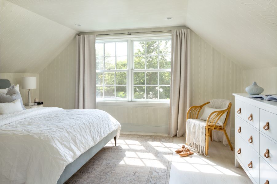
In the upstairs bedroom, she used a faded striped wallpaper. The room has many angles and different surfaces, making the space feel small and rather awkward. “We chose the Schumacher wallpaper to wrap the room so that instead of having “walls” and “ceiling,” the whole space would feel like one unified surface and enveloped the furnishings.”
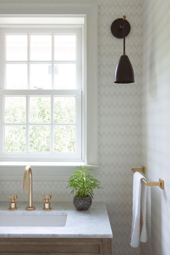
“For the powder room, I wanted something a bit more playful, yet not too busy. I selected a soft grey ikat pattern from Thibaut that picked up on the handmade floor tiles and provided a nice contrast to the oak vanity. To complete the space, we actually painted the ceiling and trim in a similar light grey, which gently transitioned into the wallpaper.”
Uncovering Color
Color is key in this home. Though distinct from each other, each room’s paint looks as though they belong together. “Color is so fascinating because each person has an innate response to color – understanding that element for clients is critical, as choosing the right tones can make a space feel like home.”
Gargano thinks, “it’s important to consider the history and environment to understand what colors feel organic and logical. Then I balance that with my own vision and my client’s preferences before settling on a palette.”
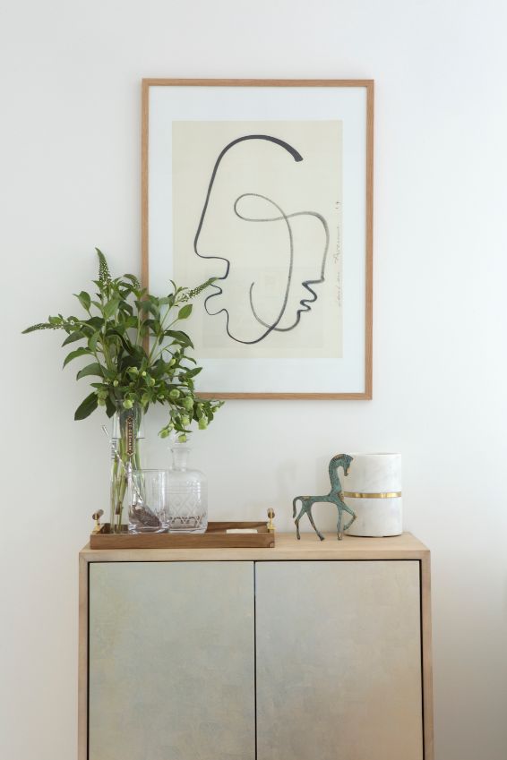
When deciding on a color, Gargano believes that the art that accents the room is vital. “Art is a key element in the spaces I design, as I often find it can anchor the room and can be a great starting point for colors, especially if there are important pieces to incorporate.”
Paintzen was able to assist Gargano with our color consultation and sampling program. The program uses data-driven consumer reports and trends in design and color theory to help inform color choices. Our color technology creates customized color palettes for you and then can send you free 8″ x 8″ swatches.

