Discover Our Favorite Green Paint Colors
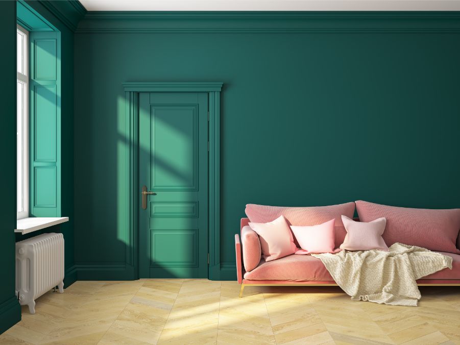
Paintzen wants to dive into the paint color green. With many popular shades of green, this paint color is quite popular.
When you think green, what does your mind first turn to? Envy? Money? Nature? Green associates with all of these, making it a hue complex emotions — but ultimately, one of balance. Here are some green paint ideas that might bring some balance to your space!
Over the past few years, with the rise of jewel tones, the color green has been emerging as a go-to shade for home painting projects. While it may not seem like the perfect color, green is an extremely versatile color and easily fits into either subtle or vibrant paint palettes.
Green works well in any room of any style, from bedrooms to kitchens, transitional to eclectic. Lighter greens, like lime or chartreuse, pair beautifully in modern settings, where deeper greens have a classic, traditional feel.
A few years ago, PPG Paints chose the color Paradise Found as the 2016 Color of the Year. They were ahead of the curve on this trend, and that easy, laid-back shade of green infused with blue undertones began to pop up everywhere, on both house exteriors and interiors, kitchen cabinets, painted shiplap, and DIY projects everywhere.
Pantone then announced their color of the year was Greenery, a vibrant yellow-green shade that graced fashion runways, art shows, and more. It’s a recognizable shade among major brands – Spotify, Shopify, and Groupon brought this shade even more into the public eye; PPG paint colors like Asparagus, and Green Pear would be good choices for those looking to mimic this iconic shade.
It’s safe to say green paint colors were on the rise. Here are some of our favorites!
Dark Green
When PPG announced their 2019 Color of the Year, Night Watch, they went even further than previous greens went.
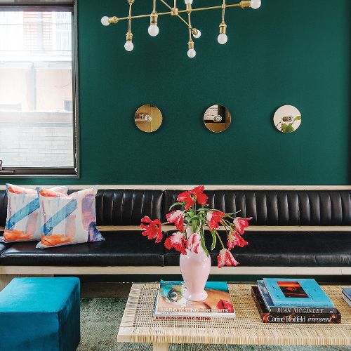
Night Watch is a classic and luxurious green that embodies the deep lush of the outdoors. It is all about reconnecting with the outdoors and nature, bring the outside in.
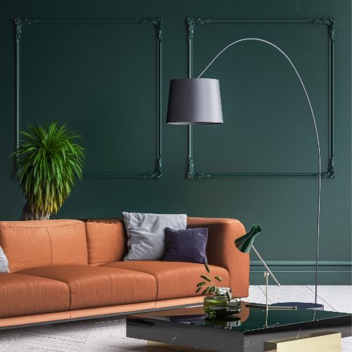
Night Watch is a beautiful green with lots of layers and depth. And we love it in this room. The deep green walls give it the feeling of a gentleman’s club — though it’s a space the whole family can relax in.
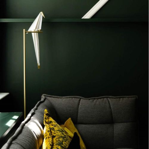
Try Pine Forest by PPG to achieve this ‘Modern Farmhouse’ inspired look above! Pine Forest is a dark, neutral, verdant green with a teal undertone.
Light Green
The world is having a moment with green overall, and the range of shades available provides a vast palette to work with. Brighter shades are disruptive, exciting, and full of life – breaking up the standard day-to-day and bringing enthusiasm to otherwise mundane paint palettes.
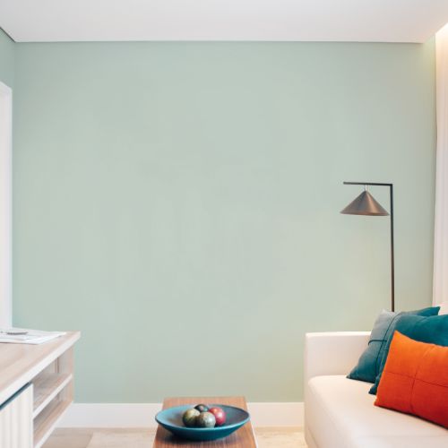
This guest bedroom uses green perfectly on an accent wall. A soft luxurious hue ties the whole room together. This lovely, calming shade of minty green complements the small space! Try PPG Echo for a similar look, and get a quote to paint your living room here.
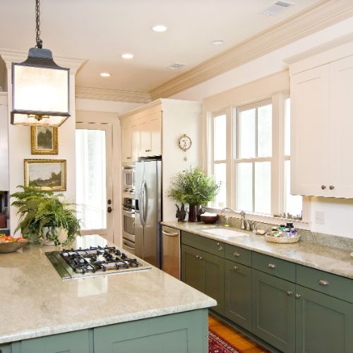
More subdued muted shades provide a sense of tranquility, relaxation, and overall “zen.” These greens are evocative of nature and harmony. They are also great in kitchens, prompting you to eat healthier as they remind you of fresh vegetables. This two kitchen uses a soft green to add a little something to the space.
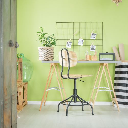
If you’re looking for energy, try a bold yellow-green, which rejuvenates with its bright spirit. Pair it with black and white for a color scheme that pops.
Aqua Green
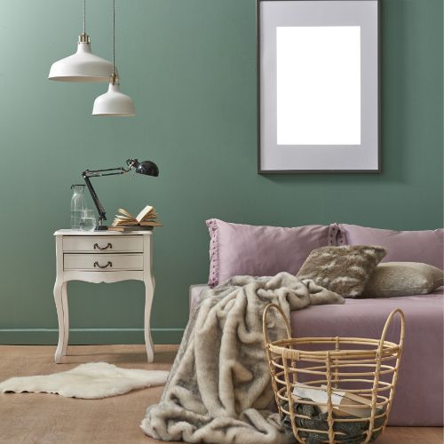
Aqua green and other jewel tones are other variants of this luxurious hue. Capture their deep, abundant spirit with a green that will have you sinking in and saying ahh.
Sage Green
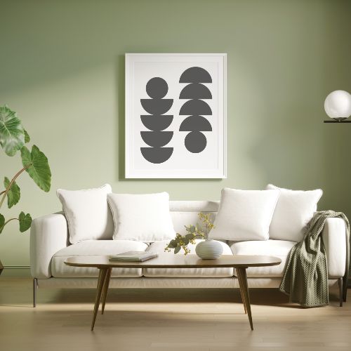
Sage, or its cousin celadon, is known for its soothing quality. Celadon got its name from a character in a French book, published in the early 1600s. The character dressed in sylvan green and was so popular, it spawned a fashion trend for years to come. So in love with the character were they, that Europeans took the name and gave it to the Chinese ceramics of that same, sea-mist hue.
Green blends the mental clarity of blue with the calm, positivity of yellow. Use it in a bedroom with black and white for a space that will start you off on your day feeling refreshed and ready to face the world.
The word “green” comes from the Middle English and Anglo-Saxon word “grene,” which takes its meaning from “grass” and “grow” in German. It relaxes and soothes us, both physically and mentally. Studies show it can help lift depression and reduce anxiety. Harness the power’s color by using a rich blue-green in a library or home office to foster clear thinking and focus.
Popular Shades of Green
Get excited about green with this inspirational video!
If you need a closer look, just let us know! Paintzen will send you free 8″ x 8″ swatches. Be sure to test out your paint colors in all different light, so you know exactly what your color will look like!
Once you’ve found your ideal shade of green, consider Paintzen for all your interior and exterior painting needs! We have hand-selected, top-rated local painters and supply high-quality PPG paints on every project. Get a FREE online paint quote today!

